Goblin's Pixelling Tutorial
All things start with an outline
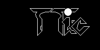 First, and most important thing I like to do in a picture is get a nice outline.
It gives you something to work with, something to perfect.
Once you get an idea, or even if you have no idea
This was done using the line tool, filled circle, the curve drawer and a
little bit of touch up work with the pixel (paintbrush) tool.
Recently I've started using GRFX2
for drawing outlines or parts of them, as its curve drawing tool with two
control points is much nicer (and easier) to use.
As an aside, I know that Danny/TBL thinks initial outlines are very important
to the picture. Back in the old days when Danny was a 100% pixeller, his main
method involved drawing a rough outline sketch using the mouse, and then
continuous refining of the outline until it was perfect - then the colouring
begun. (Now he uses a wacom graphics tablet [pen] to draw outlines).
First thing to do is set up a palette (I'll assume you're familiar with the idea of palette).
DP2 comes with a 'standard' palette that you can use, its usually better to make your own
tailored palettes though. You'll notice that DP2's palette is a series of colour gradients,
white through black, red through black, etc. The default palette is okay for
a start, but if you want to get serious about pixelling, you'll need to design
your own palettes, with the colours you want, in various gradients...
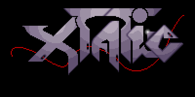
To put some colour in the outlines I used the circular fill tool with a gradient of 5 colours,
ranging from a brighter to a darker blueish-grey (I was trying for a slightly metallic look).
I find that using less colours when doing your rough shading guide means that
once you get around to fixing up the shading, creating a nice gradient, its
actually in some ways easier than if you start with too many colours.
Then again, if you don't use enough colours, it can be hard to fill up an
area without it looking really bad. For the style I wanted, I think 5 colours
was a fairly good choice.
NOTE: Beware of over-using the built-in fill tools of DP2e, a lot of the time
they're not suitable, I only used them here for a rough colour guide.
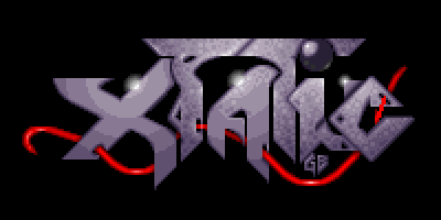
The red line was added with multiple uses of the curve tool, joined end-to-end. Nothing
special here.
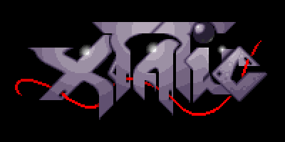
At this point you should also notice I started doing some antialiasing. Compare the lines
and curves in the outline of the 'C' with those of the 'X'.
The basic idea is this - if you have a black pixel next to a white pixel, put a grey pixel in
between them. For steeper slopes (close to vertical or close to horizontal), several pixels of
intermediate colours should be used to create a gradual change from black to white.
This is where the colour gradients in your palette come in extra handy.
Compare the outlines of the characters in this picture with those of the previous, and you should
notice a lot less jaggedness (of course, those viewing in 1280x1024 or higher might not notice :)
as well, if you're using a 256 colour display, your browser may be dithering the pictures, which
basically makes the pictures look bad).
Some people have criticized me for doing too much antialiasing (or smoothing), giving a slightly
blurred look to my pictures, but then again, I think that a lot of other people's work is not
antialiased enough, and still looks jagged. It's a fine balance, and each pixeller has to develop
their own style, and idea of what looks good. For this reason, I won't go too much more into
antialiasing.
If you're interested, I'd suggest downloading the step pictures from here and taking a closer
look. Studying works by other pixellers is always a good idea, and I'd sugggest getting stuff
from people like Niko, Made, Danny (and the others with Galleries here on GFXZ) and take a look
at their techniques (the zoom tool in DP2 is handy here).
At this step I've also done some pixel work (using the paintbrush tool) to thicken the red curve,
draw some highlights, put some texture on the 'C' and shade the dot of the 'i'.
NOTE: When you're doing fine pixelling work, especially for antialiasing, the '[' and ']' keys
on your keyboard can be invaluable in DP2. The way I antialias is to select a start colour,
select an end colour, calculate how many "in-between" steps I want, and then work out how many
colours to step through each time. For example, if I want to go from a white colour to a black
colour using 6 steps in between, and I have a gradient of 16 colours from white to black, then
this becomes 8 colours in total (the white, the black, plus six colours in between), which means
I need to use every second colour in the gradient from white to black.
Another thing to keep in mind is that the Zoom tool in DP2 should probably
be your most often used tool when drawing detail. It's extremely hard to get
the mouse cursor in exactly the right position when drawing in 320x200, let
alone higher resolutions. By zooming on the area you want to work with, this
task becomes much easier.
This step shows the antialiasing of the red curve, to give it a nice smooth look. I also drew
some gradients from red to white for highlights on the curve.
Here, I've continued working with another important aspect of any picture, the colouring and
texture. Keeping the basic colouring of the 'C' the same, I have used the paintbrush tool to
create a nicer change between the colours.
Part of the skill involved in drawing computer graphics is to hide the transition from one colour
to another. The other letters of the image have very obvious bands of colour, the 'C' has
a rougher look that hides the bands.
In this picture I chose to do a rough texture, but this is just one technique, and of course the
technique depends on personal style and the picture itself.
Ravian made a good point here, he said: the problem you're facing (and anyone
else that has thought about making tutorials) is that it's pretty hard to
explain something that's not based upon certain "chisseled in stone" rules.
He was right. The best I can say here is that I used the 2x2 paintbrush
(a small square) to plot 'blocks' of colour amongst the colour bands. I also
put a few single pixels so things were a little bit more random looking.
There's no predefined formula or rule for it - I just tried to do what looked
good to me.
I continued texturing, keeping "light-sources" in mind. By this I mean, if you
have a "light", its generally not a clever idea to make the darkest side
the side where the light is meant to be coming from.
As an example, I put small highlights on the stems of both of the 'T's, on
the diagonal line at the top of the first 'T', and on one side of the hole
in the first 'T'. This makes the light-sources more believable.
Asarhad once said to me - always finish your pictures, even if they are bad,
they are still yours. I'd have to agree with that sentiment...
BIG THANKS fly out to Ravian and Raster for their help and ideas.
And thanks to Danny, Asarhad and Sky for great input (even if they didn't
know they were giving input for this ;) ).
Get some colour in your bones
 After you've drawn an outline - your rough shape guide - what better to do
than start getting a rough colour/shading guide.
After you've drawn an outline - your rough shape guide - what better to do
than start getting a rough colour/shading guide.Antialiasing - the key to the world
 Computer Graphics - a programming approach by Steven Harrington says the following : "...lines
may have a jagged or stair-step apperance when they step from one row or column to the next. The
lower the resolution, the more apparent the effect. This is one aspect of a phenomenon called
aliasing...". Antialiasing is a technique to eliminate this in computer graphics. (The
book then goes on with a technical description of how to program antialiased line routines).
Computer Graphics - a programming approach by Steven Harrington says the following : "...lines
may have a jagged or stair-step apperance when they step from one row or column to the next. The
lower the resolution, the more apparent the effect. This is one aspect of a phenomenon called
aliasing...". Antialiasing is a technique to eliminate this in computer graphics. (The
book then goes on with a technical description of how to program antialiased line routines).Texture is your friend

Don't stop yet
Finish what you start
